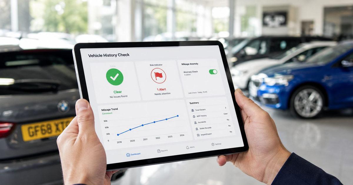
You're in the auction lane with a phone in one hand and a stock decision in the other. The vehicle report is open, the screen is crowded, and one line suggests a mileage anomaly, but the rest of the page is pushing harder than the warning itself. That's the test of user interface usability in the UK motor trade. If the tool makes the buyer pause, hunt, or second-guess the red flag, the interface hasn't done its job, and the cost shows up later as bad stock, weak pricing, or awkward post-sale conversations.
In trade buying, usability isn't about visual polish. It's about whether a buyer can make a sound decision fast, with confidence, under pressure. A well-designed vehicle history check UK workflow should help the buyer answer a simple question, is this car worth more attention or less? If the answer is hidden behind clutter, jargon, or a slow path to the important data, the product is adding risk instead of removing it. That's why usability belongs in the same conversation as vehicle provenance, dealer vehicle checks, and motor trade risk.
Table of Contents
- A Stock-Buyer's Worst Minute and What It Teaches About Usability
- What User Interface Usability Means for Trade Tools
- Translate the five components into dealer language
- The Ten Usability Heuristics Translated for Dealer Workflows
- Visibility and language beat decoration
- Control, memory, and error prevention shape fast trade use
- Recovery and help should be plain and immediate
- Metrics That Measure Dealer-Facing Usability
- Why task metrics beat vanity feedback
- Why satisfaction still matters
- Testing Methods That Fit a Motor-Trade Reality
- Three methods that actually fit dealer workflows
- Use SUS after the task, not before
- Common Pitfalls in Dealer-Facing Vehicle-Intelligence Software
- The mistakes that keep coming back
- A Practical Usability Loop for Designers, Product Managers, and Dealers
A Stock-Buyer's Worst Minute and What It Teaches About Usability
A buyer at an auction does not have time to read a report like a compliance manual. The task is to spot the one detail that changes the value call, then move before the next bid lands. If the interface buries that detail, uses vague labels, or makes the buyer decode the screen instead of the vehicle, the fault sits with the tool.

A good used car history report keeps that minute tight. A bad one turns a risk signal into a puzzle, and puzzles slow trade buyers when speed matters. A buyer should be able to see the mileage line, the keeper history, and any mismatch in a way that supports a quick decision, because that decision often happens while standing in a noisy hall with a phone in one hand. If the screen makes the buyer hesitate, the interface has already added risk.
Practical rule: if the buyer needs a colleague to explain the screen, the screen is already failing.
A second test is even more telling. A buyer spots a mileage anomaly on a phone, then has to decide whether it is a clerical issue, a data match issue, or a real warning that changes the bid. Good trade vehicle intelligence makes that interpretation obvious by separating the anomaly from the rest of the report, showing enough context to judge it, and keeping the next action clear. Poor interfaces bury the anomaly under badges, tabs, and decorative charts, which forces the buyer to slow down at the exact moment when speed is part of the risk check.
Teams building dealer tools need to test for that kind of pressure. Use real trade users, real auction tasks, and the conditions they work in. The guide to website usability testing is useful here because it keeps the focus on task success rather than opinions about colour or layout. For buyer workflows, that means testing whether someone can move from report to decision without asking where to look, what the warning means, or which screen holds the mileage history.
The quickest products are not always the prettiest. The ones dealers trust are the ones that make the right risk signal visible fast, then stay out of the way. The 10-minute pre-purchase vehicle intelligence checklist for auction buyers is a good reference point for the kind of checks a buyer should be able to complete without friction.
What User Interface Usability Means for Trade Tools
A buyer standing at the auction desk does not have time to decode a messy screen. The interface has to help them decide whether a mileage gap is a paperwork issue, a data mismatch, or a risk signal that changes the bid. In trade software, user interface usability is the part of the product that keeps those judgments fast, accurate, and defensible.
It starts with the basics: can a stock buyer, controller, or wholesaler understand the screen and act on it without friction? That is the core test. Nielsen Norman Group frames usability around learnability, efficiency, memorability, errors, and satisfaction, and the useful part for dealer tools is the testing advice, use representative users doing representative tasks. The principle matters because dealer workflows are repetitive, time-pressured, and expensive when they go wrong.
Translate the five components into dealer language
A new buyer should be able to use the platform without a long handover. A returning stock controller should know where provenance data lives without relearning the layout every Monday. Efficiency matters when the user needs the mileage check, ownership pattern, or risk signal fast enough to support an auction decision. Errors matter when the interface prevents misreads, not just when it flashes a warning. Satisfaction matters because a tool that feels awkward will not earn trust, even if the underlying data is strong.
This is the difference trade teams see every day in motor trade risk software. A polished dashboard can still be poor if it hides the one detail that changes the bid. A plain screen can still be effective if it lets buyers reach the decision point faster and with fewer mistakes. In dealer-facing tools, visual polish only helps when it reduces hesitation. If it adds scanning time, it raises risk.
For teams shaping stock and inventory workflows, the same logic applies. The guide to UK vehicle inventory management software is a useful companion because inventory systems and provenance tools fail in the same places, they bury the decision-critical detail and force the user to hunt for it.
The practical rule is simple. Usable software makes the next action obvious, not merely possible.
That is what separates a dealer vehicle checks interface from a generic reporting portal. One helps a trade user buy with confidence. The other throws data on screen and leaves the buyer to do the hard part.
Trade teams also need a way to capture what they saw while testing the product. A shared AI note taking tool helps keep those session notes tied to the task, which matters when a controller, buyer, and product manager all describe the same screen differently.
The Ten Usability Heuristics Translated for Dealer Workflows
A buyer on a live stock scan does not have time to interpret a clever interface. They need to see what the system knows, what it is unsure about, and what action comes next. Nielsen's heuristics are useful because they turn “good UX” into behaviours a team can test in that exact setting, and trade software makes the stakes obvious because the workflows are concrete.
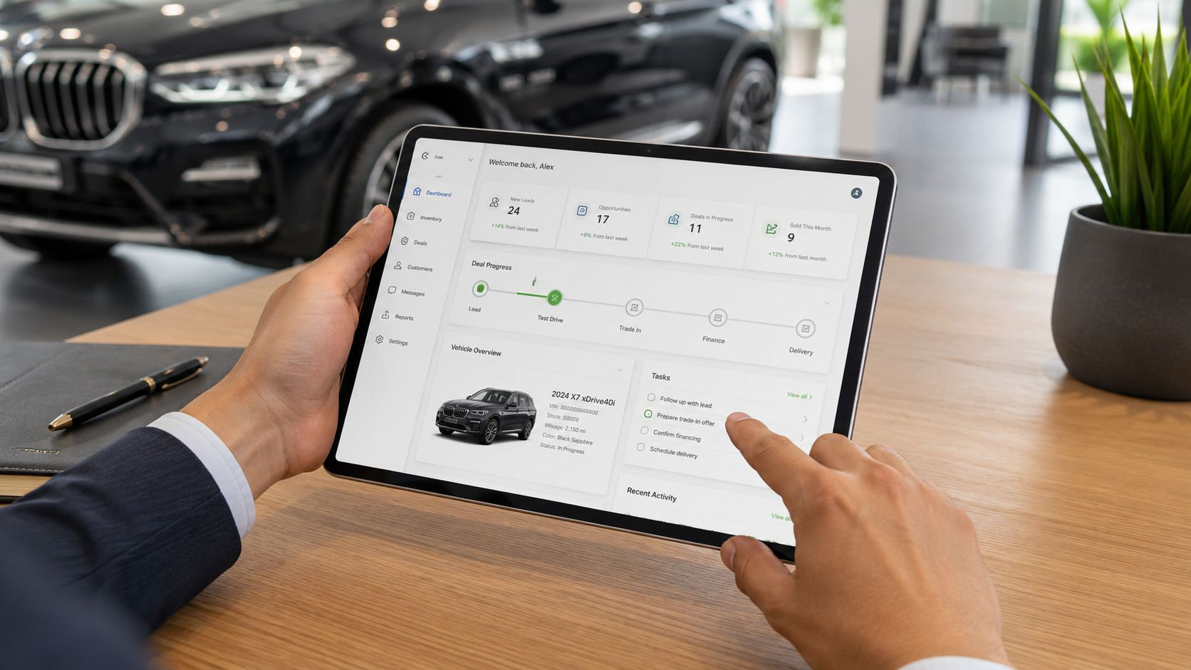
Here is the practical map I use when reviewing dealer-facing screens:
Heuristic Dealer workflow What to look for Visibility of system status Auction scanning Clear loading states, decode progress, and visible processing cues Match between system and the real world Stock comparison Plain vehicle terms, mileage language, and risk labels buyers use Consistency and standards Risk review Stable colour coding, warning levels, and layout patterns User control and freedom Provenance review Easy backtracking, reopening prior vehicles, and no dead ends Recognition rather than recall Side-by-side comparison Key facts stay on screen, instead of forcing memory across steps Error prevention Stock action confirmation Prompts before a rushed commit or irreversible move Flexibility and efficiency of use Repeat buying checks Shortcuts, filters, and faster paths for experienced users Minimalist design Red-flag review Noise removed, context retained, no clutter around the warning Help users recognise, diagnose, and recover from errors Exception handling Direct explanations and clear next steps Help and documentation Auction-floor support Help tied to the task, not hidden away from the workflow
Visibility and language beat decoration
The first pair of heuristics is the one trade users feel immediately. If the system is working on a vehicle decode, show that clearly, because buyers will assume the tool has stalled if nothing appears. If the screen talks about “events” or “flags” without explaining what they mean, it is using internal language instead of the dealer's language.
Match between system and the real world matters because a mileage issue should be described in plain terms, not in a way that forces the buyer to interpret the terminology. Consistency and standards should keep colour coding, labels, and warning levels uniform across the product, because inconsistent risk presentation slows judgment and creates hesitation. In practice, that means a buyer can move from auction scanning to a stock comparison without relearning the meaning of the same alert.
Control, memory, and error prevention shape fast trade use
Trade users often compare vehicles side by side, then return to one report and check a warning again before they bid. User control and freedom matters because they need to back out of a report, reopen a previous vehicle, or compare provenance data without losing context. Recognition rather than recall is just as important, because buyers should not have to remember a registration or a chain of screens to understand the vehicle's risk profile.
Error prevention is where good trade software pays for itself. A confirm-before-commit prompt before a stock action can stop a rushed mistake. Flexibility and efficiency of use matters too, because experienced buyers want shortcuts, not extra clicks. Minimalist design should remove noise from the red-flag view, not strip away the context that gives the warning meaning.
Recovery and help should be plain and immediate
When something goes wrong, help users recognise, diagnose, and recover from errors with a message that says what happened and what to do next. The best interfaces also keep help and documentation close to the task, not hidden in a support centre that nobody opens mid-auction. Nielsen's guidance on using familiar words, keeping key information visible, and writing plain-language error messages is especially relevant here (Nielsen Norman Group).
For teams reviewing how alerts, filters, and provenance flags should sit together in a decision screen, the automotive data analytics guide is a useful companion. It helps frame the trade-off between dense information and the speed buyers need when they are deciding whether a vehicle deserves another look.
Metrics That Measure Dealer-Facing Usability
A dealer tool can look tidy and still create risk. The better test is whether a buyer can clear the screen, trust the result, and move to the next decision without asking for help. In a stock-buying workflow, the metrics that matter are task success rate, time on task, error rate, and subjective satisfaction, because they show whether the interface helps a buyer complete the job under pressure. Nielsen Norman Group recommends starting with the highest-risk and most frequent tasks, which fits dealer work far better than chasing general praise (Nielsen Norman Group).
Usability Metrics and What They Tell You About a Dealer Tool Metric What It Measures How to Collect It on a Dealer Tool What a Shift Signals Task success rate Whether the buyer completed the task Observe whether users decode a registration, inspect mileage anomalies, or locate provenance warnings without help The workflow is becoming clearer, or it is adding friction Time on task How long the task takes Time the full journey from search to decision point A faster flow usually means fewer unnecessary stops Error rate Where users go wrong Log misclicks, wrong paths, or missed warnings during testing The screen may be confusing or the hierarchy may be weak Subjective satisfaction How the tool feels to use Capture post-task ratings and comments Users may trust the data, or they may still feel uncertain If you want one operational target, start with the tasks that carry the most decision risk. A practical example is to aim for a 90% task success rate on mileage anomaly detection before you treat a release as ready for wider dealer use. The exact target will vary by workflow, but the point stays the same, high-risk tasks need proof, not assumptions.
Why task metrics beat vanity feedback
A buyer saying “it looks fine” tells you very little. Watching the same buyer stall on a provenance flag tells you something useful. That is why task-based measurement is stronger than broad sentiment in trade software. The goal is not to collect praise, it is to see whether the workflow supports quick, accurate buying.
This also helps product teams avoid the usual trap. Visual polish can hide friction for a while, but a buyer who loses time searching for a warning will still feel the cost in the middle of a live decision.
Why satisfaction still matters
Subjective usability is not soft data if you measure it properly. A standard approach is to use the System Usability Scale immediately after a task session, with alternating positive and negative statements to reduce response bias, then convert the result into a 0–100 benchmark that can be tracked over time (Qualaroo). In a dealer tool, that score becomes useful when you compare it to a layout change, a new risk summary, or a revised search flow.
Practical rule: if task time improves but satisfaction falls, the interface may be faster but harder to trust.
That trade-off shows up often in dealer-facing software. A dense screen can save a click and still slow the decision, while a cleaner layout can remove noise and make the buyer more confident. Teams that want to connect those usage signals with broader buying behaviour can also look at automotive data analytics for dealer decision workflows, and at Otter A/B's approach to device consistency when they need the same task to behave reliably across phone, tablet, and desktop.
Testing Methods That Fit a Motor-Trade Reality
A dealer screen can look clean in a design review and still fail on a forecourt. The test is whether a buyer can make a risk call while juggling poor signal, a noisy environment, and a phone that may be doing the whole job. Usability testing should reflect that pressure, because in trade software a small delay can turn into a bad stock decision.

Three methods that actually fit dealer workflows
Remote unmoderated testing works well for narrow questions. Recruit 5 to 8 trade buyers, keep the session to about 30 minutes of actual task time, and ask them to complete one focused workflow without help. That setup is useful if you want to know whether someone can spot a mileage inconsistency, read a provenance summary, or understand a warning label on a small screen.
Moderated sessions suit higher-stakes screens. Bring in the same kind of trade users, 5 to 8 buyers or appraisers who match the role you are building for, and give them a clear scenario based on real work such as reviewing a vehicle report or deciding whether to call a car through. Keep the session around 30 to 45 minutes, because longer sessions usually drift away from the decision moment you need to examine. The value here is not speed, it is hearing where the interface caused hesitation, doubt, or a wrong assumption.
Guerrilla testing belongs where the product will be used. Run it in an auction house, on a forecourt, or in another trade setting where the user is already under time pressure. Use one or two core tasks, watch the device in hand, and test on connections that reflect real conditions, including a 3G simulation or similarly constrained network. If the screen only works on a stable office connection, it is not ready for dealer use.
A useful way to think about the mix is simple.
- Remote unmoderated testing suits early direction checks, when you want quick signal on whether a screen is legible.
- Moderated testing suits high-risk workflows, when you need to hear why a buyer hesitated or misunderstood a label.
- Guerrilla testing suits device and environment checks, especially when the question is whether the design still works in an actual trade setting.
Use SUS after the task, not before
The System Usability Scale belongs immediately after the task session, while the experience is still fresh. The alternating positive and negative wording helps reduce response bias, and the resulting score gives product teams a consistent way to compare one release with another. In dealer tools, that is useful when a new screen claims to reduce friction but users say it feels harder to trust than the older version.
Device consistency deserves the same treatment. The Otter A/B approach to device consistency is a practical reminder that the same interface can behave differently across phones, tablets, and desktop layouts, so testing should include the devices your buyers use. If the workflow breaks on a smaller screen or on weaker connectivity, that is a release risk, not a minor bug.
Teams that deal with remote stock decisions should also ground testing in realistic buying behaviour. The guidance in remote vehicle appraisal best practices for distance purchases is useful here because it keeps the test focused on decision quality, not just on whether the screen looks tidy.
Common Pitfalls in Dealer-Facing Vehicle-Intelligence Software
The worst usability problems in trade software are usually not dramatic. They're small design choices that create delay, confusion, or false confidence. A buyer sees a warning too late, or sees too many warnings too early, and the interface stops helping them prioritise risk.
The mistakes that keep coming back
One common failure is hiding the high-risk signal behind too many clicks. Another is putting a dense wall of information on the first report view, then expecting the buyer to sort it out under time pressure. Internal jargon causes the same damage, because a trade user doesn't want to translate the platform's language before they can evaluate the vehicle.
Desktop-first design causes problems too. Buyers are often checking stock on phones in environments with bad reception, which means layouts that look fine on a wide monitor can become awkward on a small screen. Accessibility gets treated as a later improvement when it should be a baseline. That's a poor trade-off in any product, but especially in a decision tool.
The bigger issue is that teams often test in ideal conditions and ship for imperfect ones. Good trade software should work across devices, under pressure, and for users with different levels of digital confidence. If it doesn't, the interface is asking too much of the buyer at exactly the moment they need the product to do the heavy lifting.
For a more blunt assessment of why surface-level checks miss the point, the article on why traditional provenance checks are no longer enough for professional traders is worth reading alongside your own internal workflows.
The right test is never “does it look modern?” It's “does it help the buyer avoid a bad decision quickly?”
That's the practical standard. Usability in dealer software should be judged against the conditions of real buying, not against a generic interface ideal.
A Practical Usability Loop for Designers, Product Managers, and Dealers
The simplest usable workflow is also the one often skipped. Start with the highest-risk trade task, design the screen around the heuristics that matter, test it with representative users, measure what happened, and iterate. That loop keeps user interface usability tied to buying outcomes instead of surface preference.
Designers should check whether the next action is obvious, whether the language matches the dealer's world, and whether warnings are visible without overwhelming the page. Product managers should track task success rate, time on task, and SUS together, because no single metric tells the full story. Dealers should give feedback in task terms, not generic complaints, so the team knows whether the problem is search, hierarchy, wording, or trust.
For trade-only products, that loop is especially important because the workflow is already commercial. Every improvement has a direct path to decision quality, and every usability failure adds a layer of risk. Platforms that handle provenance and point-of-decision intelligence need that discipline built in, not bolted on after launch.
A CTA for AutoProv is straightforward, use it to tighten your vehicle history check UK process, sharpen your vehicle provenance review, and give your team a clearer way to manage motor trade risk at the point of purchase.
Frequently Asked Questions
AI-Generated Content Notice
This article was created with the assistance of artificial intelligence technology. While we strive for accuracy, the information provided should be considered for general informational purposes only and should not be relied upon as professional automotive, legal, or financial advice. We recommend verifying any information with qualified professionals or official sources before making important decisions. AutoProv accepts no liability for any consequences resulting from the use of this information.
From our AI insights
- Essential Pre-Purchase Checklist for UK Motor Traders
Ensure a seamless vehicle acquisition with our detailed pre-purchase checklist tailored for UK motor traders.
- Leveraging Auction Data for Strategic Car Purchases
Discover how to use auction data effectively to make profitable car buying decisions.
- Auction Pitfalls: Avoiding Costly Mistakes
Navigate UK car auctions with confidence by avoiding finance, write-off, and mileage risks.
Related Articles

Your Ultimate Guide to Buying a Used Car in the UK
Navigate the UK used car market with confidence using our comprehensive buying guide. Tips, checks, and AutoProv Provenance insights included.

Difference Between MOT and Service: What You Need to Know
An MOT is a mandatory legal inspection that every car on UK roads needs to pass.Think of it as the government's way of ensuring your vehicle meets the absolute minimum safety and environmental standards to be considered roadworthy. A service, on the other hand, is a completely different beast. It's the proactive maintenance routine recommended by the people who built your car, designed to keep it running smoothly and catch problems before they start. In short, an MOT is a pass-or-fail exam required by law. A service is a comprehensive health plan for your car.

Your Ultimate Used Car Inspection Checklist
A solid used car inspection checklist is the single most powerful tool you have to avoid buying a lemon. It gives you a methodical way to look past the shiny paint and assess a car's real condition, helping you spot hidden problems and get a fair price before you shake hands on the deal.
Published by AutoProv
Your trusted source for vehicle intelligence